Math- Extended
Unit 1: Probability and Statistics
Probability
Probability is the likelihood of an event occurring. For any event A, the numerical value of P(A) is assigned, which is a measure of the likelihood of it occurring. Probability must satisfy a list of axioms, or rules:
- For any event A, P(A) ≥ 0. All probabilities have a value greater than or equal to zero. The smallest value an event can take is 0, meaning it is impossible. P(A) cannot be less than 0.
- For a sample space S, P(S) = 1. The probability of all occurrences within a sample space is equal to 1. A sample space is a set of all possible outcomes from an experiment. For example, for a six-sided die (or a D6), S = {1, 2, 3, 4, 5, 6}. 1, 2, 3, 4, 5, and 6 are all the possible occurrences for the event of rolling a D6, because they are within the sample space S.
- The probability of any event happening is a number between 0 and 1, or 0 P(A)1.
- All probabilities of events happening should add up to 1.
Probability can be illustrated through a tree diagram:
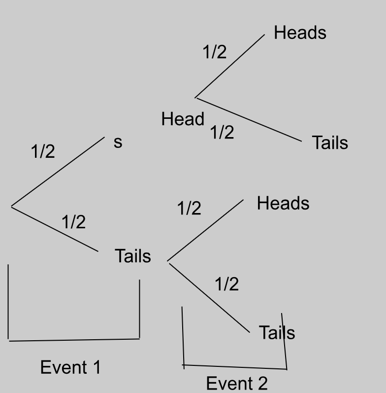
This tree diagram shows the possible outcomes of flipping a coin twice. The first flip is the first “event”, which has two outcomes, getting heads or tails, of which there is a ½ probability of getting either. The second flip is the second “event”, which again has two outcomes, getting heads or tails, for each outcome of the first event.
If we want to find the probability of getting two heads in a row, we multiply the probabilities of the desired outcomes against each other.
So, there’s a ¼ chance that we’ll get two heads in a row.
Theoretical probability
Theoretical probability is the probability of an event occurring based on mathematical predictions. The formula for theoretical probability of an event A is:
For example, if you’re flipping a fair coin, the theoretical probability for the coin to land on ‘heads’ is P(Heads) = ½ = 0.5. Similarly, the theoretical probability for the coin to land on ‘tails’ is P(Tails) = ½ = 0.5. This means that according to theoretical probability, the chances of landing a heads or tails per coin flip are equal.
Experimental probability
Experimental probability is the probability of an event occurring based on the number of times the event occurred during an experiment and how many times the experiment was repeated. The formula is:
For example, if you flip a fair coin ten times, you might get ‘heads’ 8 times and ‘tails’ 2 times. So the experimental probability for the coin to land on heads is P(Heads) = 8/10 = 0.8. Similarly, the experimental probability for the coin to land on tails is P(Tails) = 2/10 = 0.2.
Despite the theoretical probability predicting that the results would be a 50% chance of heads or tails, experimental probability showed us that for flipping the coin 10 times, the chances of getting heads were 0.8 and 0.2 for tails.
Hence, experimental probability ≈ theoretical probability.
However, repeating the experiment multiple times will bring the result closer to theoretical probability.
Dependent and independent events
Dependent and independent events refer to the influence one event occurring has on the probability of the other event occurring.
If a coin is flipped and it lands on heads, it is equally as likely to land on heads or tails if flipped again. Landing on heads does NOT affect the probability of landing on heads or tails later. This makes a coin landing on heads and a coin landing on tails independent events, because the probability of one event occurring does NOT affect the probability of the other event occurring.
To calculate the probability of a pair of independent events occurring, simply multiply the probabilities. For example, continuing with our coin toss example (Heads = H; Tails = T):
If a bag of chocolate containing 5 pieces of dark chocolate and 5 pieces of white chocolate is opened, then the probability of selecting a piece of dark chocolate is 5/10, and that of selecting a piece of white chocolate is also 5/10.
However, if you open the bag, pick a piece of dark chocolate, and eat it, then the probability of selecting a piece of dark chocolate again is now only 4/9, because you ate 1 piece of dark chocolate (5 - 1 = 4) and one piece of chocolate from the bag overall (10 - 1 = 9). This also affects the probability of choosing a piece of white chocolate, which is now 5/9.
Taking a piece of chocolate from the bag and eating it is a dependent event, because the outcome of one event affects the probability of the possible outcomes of another event.
Continuing with our chocolate example (Dark chocolate = D; White chocolate = W):
“W, given D” can be rewritten as:
Because the probabilities of the events depend on one-another, the probabilities intersect. So, if we presented this as a Venn diagram, P(D) and P(W) would be two intersecting circles, or P(DW)
Mutually exclusive and combined events
Mutually exclusive and combined events refer to whether or not the chances of one outcome occurring overlap with another outcome occurring.
If, for two events A and B, A cannot occur if B occurs, then the events are mutually exclusive. On a Venn diagram, this would show up as two circles that DO NOT intersect. Therefore BA = nothing.
This can be written in Venn diagram form as:
Card examples
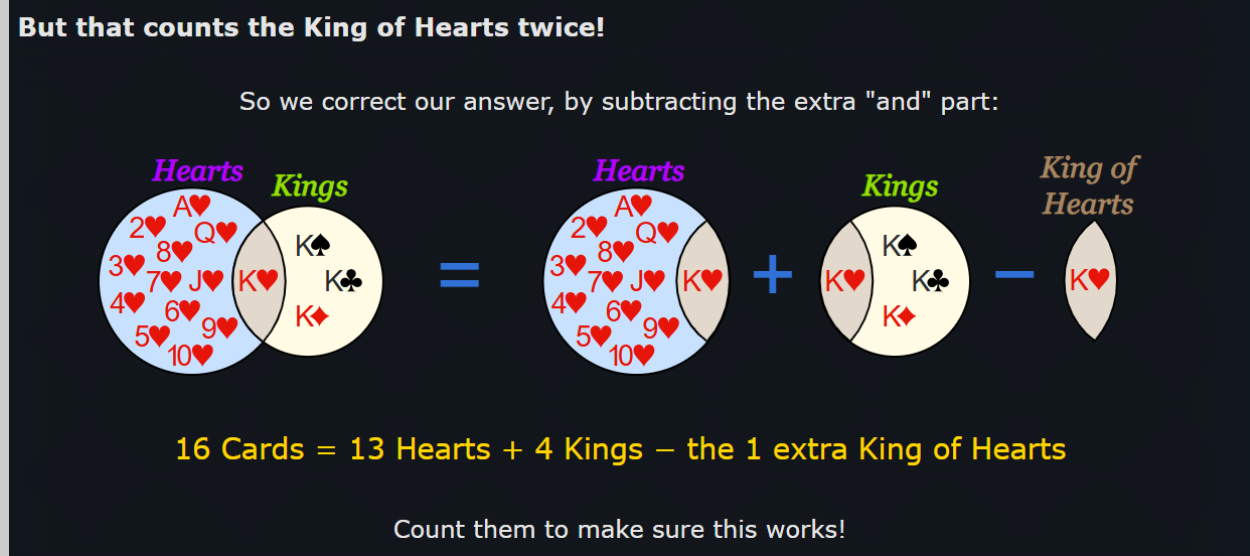
Let’s move on to cards. The probability of picking a heart card from a complete deck of cards is 13/52. The probability of picking a king card from a deck is 4/52. But within the heart cards, there is a king of hearts! And within the king cards, there is the king of hearts again!
Because the outcome of picking the king of hearts card from the deck is common between both events, these events are combined events, or ones where for two events A and B, A and B can occur simultaneously, or at the same time.
Remember, the probability of the union of two or more events can never be more than 1.
So, the probability of choosing a heart card is 13/52, or P(H) = 13/52.
And the probability of choosing a king card is 4/52, or P(K) = 4/52.
If we wanted to find the probability of both events occurring at the same time, we would write “the probability of choosing a heart card or a king card”. In Venn diagram notation form, this would be:
= 13/52 + 4/52
= 17/52
There are 13 desirable outcomes where a heart card is picked, and one of these outcomes is picking a king of hearts.
There are 4 desirable outcomes where a king card is picked, and one of these outcomes is picking a king of hearts.
So by adding 13 + 4 directly, we’re REPEATING the outcome of picking a king of hearts, which isn’t possible because we only have a single king of hearts card! And because if a king of hearts card is picked, then both outcomes are fulfilled at the same time! Which would make it P(H and K), or P(HK), which is not what we’re looking for!
Instead, we’re going to subtract the probability of picking the common outcome from P(HK):
OR vs AND
If you wanted this in a visual format, this graphic from Math Is Fun should help:
To remember what “” and “” signify, remember that “OR holds more than AND”: “” is shaped like a cup, which can hold more water than “”.
Data Handling
Discrete and Continuous Data
Discrete data is data that can only take specific, finite values. It cannot take on any values between these specific values in an interval. It is discrete because there is a limited amount of “answers” or values that fall into the interval.
If you’re being surveyed on how many pet cats you have, you can only say 1, 2, 3, or any other whole number. You can’t say (and it would be horrifying if you did) that you have 0.5 of a cat.
For example, in the interval [1, 10], which includes numbers from 1 to 10, discrete data may only consider whole, natural numbers, so 1, 2, 3, 4… 10. These values are finite, meaning they can be counted.
Continuous data is data that can take infinite values in an interval or between two distinct, given points.
For example, in the interval [1, 10], continuous data may include whole numbers like 1, 2, and 7; decimals like 1.69, 4.20, 8.88903123; or fractions like 3/6. Meaning, it can take an infinite and endless number of values. It is continuous because there is an infinite range of “answers” or values that fall into the interval.
If you’re being surveyed on your height, there’s a broad range of answers you can give. You can be 182 centimeters, 183.5, 190.5839 cm (sorry Americans, no feet here).
Sampling techniques
Data can be collected through surveying populations, which is the total number of people regarding whom conclusions are to be drawn. However, in the case of extremely large or varied populations, data is collected from samples, which are a small group of people from the total population from whom data will be collected.
Samples can be chosen through probability and nonprobability sampling methods:
- Probability sampling methods use random selection, meaning ideally, everyone in the population is just as likely to be part of the sample as not.
- Non-probability sampling methods are ones where individuals are chosen based on certain criteria and aren’t randomly chosen. This means that only certain individuals are likely to be chosen as part of the sample and not everyone is just as likely to be part of the sample as not. This is usually done not to test a hypothesis, but rather to observe a minority population or one that isn’t researched well.
Response rates
A response rate is the percentage of people who completed the survey out of all the individuals who were sent the survey or were part of the sample, or:
High response rates are ideal for surveys because they reduce the chances of errors such as nonresponse bias. Furthermore, the greater your response rate is, the more applicable the results of the sample are to the greater population, because more people have participated in the survey, making the results more accurate to how they would be if the entire population participated in the survey.
Nonresponse bias is when a specific group or demographic fails to respond to the survey, resulting in a biased and inadequate response.
For example, an entire group of people who follow a certain religion may be unintentionally excluded from the survey if it is sent out on a religious holiday when they are unavailable.
Data Manipulation and Misinterpretation
Data manipulation refers to the way data is selected, presented, or processed in order to influence interpretation. Misinterpretation occurs when data is read incorrectly or conclusions are drawn without sufficient justification.
Common Forms of Data Manipulation
- Selective Data: Only showing data that supports a claim while ignoring contradictory values.
- Misleading Graph Scales: Truncated axes or uneven intervals exaggerate or minimize differences.
- Inappropriate Averages: Using the mean instead of the median when data contains outliers.
- Small Sample Sizes: Drawing conclusions from insufficient data reduces reliability.
- Percentages Without Reference: Percentages given without stating the total sample size.
Examples of Misinterpretation
- Assuming correlation implies causation.
- Interpreting trends without considering random variation.
- Overgeneralizing results beyond the target population.
Limitations in Statistics
Statistics cannot provide absolute certainty. All statistical conclusions are subject to limitations related to data collection, analysis, and interpretation.
Key Statistical Limitations
- Sampling Bias: The sample does not accurately represent the population.
- Measurement Error: Inaccurate tools or human error affect data quality.
- Outliers: Extreme values can distort measures such as the mean.
- Random Error: Natural variation that cannot be controlled.
- Assumptions: Many statistical methods rely on assumptions that may not hold.
Limits of Conclusions
- Statistical results describe likelihood, not certainty.
- Results are only valid for the population studied.
- Predictions become weaker the further they extend beyond the data range.
Required Context in Statistics
Context is essential for interpreting statistical results correctly. Without context, numerical values can be misleading.
Important Contextual Factors
- Source of Data: Who collected the data and for what purpose.
- Population: The group the data represents.
- Time Frame: When the data was collected.
- Conditions: External factors that may have influenced the data.
Why Context Matters
- Identical statistics can imply different conclusions in different situations.
- Helps identify bias and limitations.
- Prevents incorrect generalization and misuse of data.
In IB MYP 5, students are expected to critically evaluate statistical information by identifying manipulation, acknowledging limitations, and interpreting results within an appropriate real-world context.
Graphs
Types of Graphs
Pie charts show what fraction of the total different categories of responses make up. They involve drawing a circle and dividing it into appropriate wedges depending on the percentage of responses that fall into each category.
However, pie charts are hard to interpret properly, can’t be scaled, hard to draw, and make it difficult to compare responses side-by-side.
To find the angle of a wedge in a pie chart:
For example, for 22 responses out of 50 that fall into one wedge:
Bar Charts
Bar charts are used for data which is categorical, or has no order, like eye colour. They are usually used to show comparison between categorical data collected of two different sample groups, or to show the response breakdowns within a sample group.
Stem and Leaf Plots
Stem and leaf plots are used to organize data so it can be read quickly, or to find quartiles.
Here, 2 is the stem, as it represents the range of all values with a 2 in the tens place. Meanwhile, the leaf includes actual values like 22, 26, and 29.
The stem, or the value on the left, has the range, while the leaf, or the value on the right, has the actual values. They only reorganize raw data that is already given and can’t be used for analysis, only for organization.
Pictogram Graphs
Pictogram graphs use symbols or pictures to represent data. Each symbol represents multiple pieces of data; for example, for a pictogram showing the number of Girl Scout cookie sales per year, a picture of a single cookie can represent 200 cookies sold.
Bivariate Graphs
Bivariate graphs are graphs that display the relationship between two variables. These variables can be continuous or discrete. Bivariate data is used to determine whether one variable influences another or to identify patterns, trends, or correlations.
For example, if you record the hours studied and the corresponding test scores of students, hours studied would be one variable and test scores the second variable. A bivariate graph allows you to visually inspect the relationship between these two variables.
Scatter Graphs
Scatter graphs, or scatter plots, are a type of bivariate graph that uses Cartesian coordinates to display values for two variables for a set of data. Each point on the graph represents one observation, with the x-coordinate representing the first variable and the y-coordinate representing the second variable.
Scatter graphs can reveal trends, correlations, or outliers in data. For example, plotting hours studied (x-axis) against test scores (y-axis) may show that as study hours increase, test scores also tend to increase.
Advantages: Easy to identify relationships and outliers. Limitations: Does not show the exact numerical value of the correlation.
Box Plots
Box plots, or box-and-whisker plots, are graphical representations that summarize data using five key values: minimum, first quartile (Q1), median (Q2), third quartile (Q3), and maximum. They are useful for identifying the spread, central tendency, and outliers in a dataset.
Construction:
- Draw a number line that covers the range of the data.
- Draw a box from Q1 to Q3.
- Draw a line inside the box at the median.
- Draw “whiskers” from the box to the minimum and maximum values.
Uses: Compare distributions, detect skewness, visualize range and quartiles.
Cumulative Frequency Graphs
Cumulative frequency graphs (or ogives) are used to display the cumulative frequency of a dataset. They show the running total of frequencies up to each class interval.
Construction:
- Determine class intervals for the data.
- Calculate cumulative frequencies by adding the frequencies of each interval to the previous total.
- Plot cumulative frequency points against the upper boundaries of each class interval.
- Join points with a smooth curve.
Applications: Determine median, quartiles, and percentiles; visualize distribution of data.
Lines of Best Fit
The line of best fit is a straight line drawn on a scatter graph that best represents the trend of the data. It minimizes the distance between the line and all points on the scatter plot, often using the method of least squares.
Uses:
- Predict values for one variable based on the other.
- Visualize correlation between variables.
- Identify trends in data.
Steps to construct:
- Plot all data points on a scatter graph.
- Estimate a line that has approximately equal number of points above and below it.
- Use the line equation (y = mx + c) to calculate predicted values.
Mean, Median, and Mode
Measures of central tendency describe the average or typical value of a dataset.
- Mean: Sum of all values divided by the number of values.
- Median: Middle value when data is arranged in ascending order. If even number of values, the median is the average of the two middle values.
- Mode: The value that occurs most frequently in the dataset. There can be more than one mode or no mode at all.
Quartiles and Percentiles (Discrete, Grouped, and Continuous Data)
Quartiles divide data into four equal parts. Percentiles divide data into 100 equal parts.
Quartiles:
- Q1 (first quartile): 25th percentile
- Q2 (second quartile / median): 50th percentile
- Q3 (third quartile): 75th percentile
Finding quartiles and percentiles:
- Discrete Data: Arrange data in ascending order, use position formula Qk = k(n+1)/4.
- Grouped Data: Use cumulative frequency table and interpolation formula to calculate quartiles.
- Continuous Data: Similar to grouped data; use cumulative frequency curve or table for precise calculation.
Measures of Dispersion
Measures of dispersion describe how spread out the data is. Common measures include:
- Range: Difference between maximum and minimum values.
- Interquartile Range (IQR): Difference between Q3 and Q1.
- Variance (σ² for population, s² for sample): Average of the squared deviations from the mean.
- Standard Deviation (σ or s): Square root of variance; indicates average distance from the mean.
Correlation
Correlation describes the strength and direction of the relationship between two variables.
- Positive correlation: As one variable increases, the other variable also increases.
- Negative correlation: As one variable increases, the other variable decreases.
- No correlation: No apparent relationship between the variables.
- Strong vs Weak correlation: Strong correlation: points closely follow a line. Weak correlation: points are widely scattered.
Correlation coefficient (r) quantifies the strength and direction of linear relationship between variables:
Use technology (like calculators or software) to calculate r for precise numerical value and interpretation.
Frequency, Data, and Cumulative Frequency
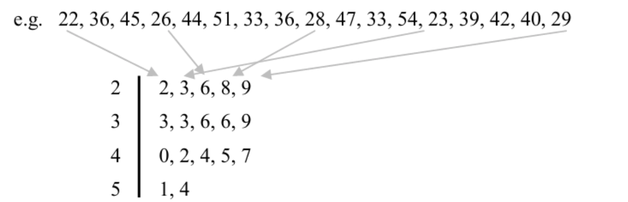
Let’s say you’re doing a survey on the number of children people have in their basement. You ask 20 people and get the following responses:
Responses: 1, 4, 5, 15, 8, 2, 5, 9, 7, 6, 12, 11, 2, 3, 4, 6, 6, 8, 12, 10
Whew, that’s a lot of data! Kind of intimidating to look at. If we wanted to do anything with this data, like plot it on a graph, or draw any kind of meaningful connections from it, we need to organize it first.
Notice how some of the values repeat? You could say they appear frequently. Frequency means how often something happens or appears.
Frequency Table
We organize this data based on the type of response given (number of children) and the number of people who gave that response:
| Number of Children in Basement | □ Frequency |
|---|---|
| 1 | 1 |
| 2 | 2 |
| 3 | 1 |
| 4 | 2 |
| 5 | 2 |
| 6 | 3 |
| 7 | 1 |
| 8 | 2 |
| 9 | 1 |
| 10 | 1 |
| 11 | 1 |
| 12 | 2 |
| 15 | 1 |
This table represents discrete data (data consisting of separate, distinct values). It is impossible to have 7.5 children or negative children.
Plotting the Data
If we were to plot this data on a graph:
- The x-axis represents the number of children in the basement (independent variable).
- The y-axis represents the frequency (dependent variable).
Each bar is separate because the data is discrete. It’s either a specific number of children or not.
Mean, Median, Mode, and Range
We can calculate the mean, median, mode, and range from the frequency table.
Mean
The mean is the average value of a dataset:
Or, using frequency:
Where f is the frequency and x is the data value. Sigma (Σ) refers to summation of all entries.
Example for 12 children row: 12 * 2 = 24; divided by frequency 2 = 12. This matches manually adding each 12 individually (12 + 12 = 24, 24/2 = 12).
Median
The median is the middle value of the data set. For an ordered list:
- If the number of values is odd, the median is the middle number.
- If the number of values is even, the median is the mean of the two middle numbers.
Example: 5, 3, 6, 3, 9 → sorted: 3, 3, 5, 6, 9 → median = 5
Example with even numbers: 5, 3, 6, 3, 9, 2 → sorted: 2, 3, 3, 5, 6, 9 → middle numbers: 3 and 5 → median = (3+5)/2 = 4
For large datasets (n terms), use formula for median position:
This gives the position in the ordered dataset to find the median.
Mode
The mode is the value that occurs most frequently. In this frequency table, 6 occurs 3 times, making 6 the mode.
Range
Range is the difference between the maximum and minimum values:
From the table: 15 - 1 = 14
Median, Mode, and Range (Continued)
So we have (5 + 1) = 6; 6 / 2 = 3.
BUT WAIT! THAT’S NOT OUR ANSWER! Remember that since we did all the shabang with the positions of the numbers, the answer we get is the position of the median. In this case, the median is the number that occupies the 3rd position in the data set. Counting, we find that 5 occupies the third position, making it the median!
What if we have an even number of numbers?
Example: 2, 3, 3, 5, 6, 9 → N = 6
(6 + 1) = 7 → 7 / 2 = 3.5
The median will be the number that occupies the 3.5th position. Since there is no 3.5th position, we take the mean of the numbers in positions 3 and 4: 3 and 5 → (3+5)/2 = 4. So the median is 4!
Important: The median does not necessarily have to be a value that exists in the data set; it must simply be the value in the middle of the dataset.
Mode
The mode is the most frequently occurring value. A dataset can be unimodal or bimodal. Any more than 2 modes is not counted.
Range
The range is the difference between the highest and lowest values. It indicates how much the data varies. Beware of outliers: if most data is small but one value is extremely high, the range can be misleading.
Cumulative Frequency
Cumulative frequency helps us find the total number of data entries up to a certain class limit. It is particularly useful for grouped or continuous data.
Grouped/Continuous Data Example
Not all data comes as distinct, separate values. Some fall within ranges. For example, if surveying people’s heights, responses are continuous (5.5, 5.4, 5.11 feet, etc.). We group data into class intervals:
| Time taken to run 100 meters (seconds) | Frequency |
|---|---|
| 7 - <9 | 3 |
| 9 - <11 | 12 |
| 11 - <13 | 18 |
| 13 - <15 | 20 |
| 15 - <17 | 7 |
| Total | 60 |
Here:
- First number in a class = lower class limit
- Second number in a class = upper class limit
- Frequency = number of entries in that interval
Example: 12 times fall into 9 - <11 class. The exact values are unknown; they could be 9, 9.1, 10.5, etc.
Cumulative frequency: Total number of entries up to a certain class. It is calculated by adding the frequency of a class to the sum of all previous class frequencies.
Cumulative Frequency
Cumulative frequency measures the “running total” as you go along. Essentially, how much do you have in total up to a certain class limit that increases the further you go down, till you reach the maximum class limit that encompasses all the scores and you get all the people in it.
Example Table
| Time taken to run 100m (s) | Frequency | Cumulative Frequency |
|---|---|---|
| 7 - <9 | 3 | 3 |
| 9 - <11 | 12 | 15 |
| 11 - <13 | 18 | 33 |
| 13 - <15 | 20 | 53 |
| 15 - <17 | 7 | 60 |
Now, we can plot this on a graph with the leftmost column on the x-axis, and the rightmost column on the y-axis. But there’s a catch– since these are class intervals, we can’t plot both values. We plot the upper value, because the cumulative frequency is a measure of the values up to the upper limit of each progressive class interval.
This produces a graph called a cumulative frequency graph, which can be divided into various intervals for easy interpretation. The graph ends at 60, which means 60 people in total took the survey. The point at 60 has an x-coordinate of 17, indicating that all 60 people have running times ≤17 seconds.
With this graph, if we take any point on the y-axis and draw a line to meet the graph, then draw a line down to the x-axis, we can estimate values. The y-axis point = number of people. The x-axis point = approximate value of the data. Approximate because we are using grouped data.
Quartiles
Quartiles are a neat way to sift through data in a cumulative frequency graph.
Lower Quartile (LQ)
Calculated as:
In this example: 25% of 60 → LQ = 15. Drawing a line to the x-axis, we get 11. Meaning: 15 people ran ≤11 seconds. 25% ran ≤11 seconds, 75% ran ≥11 seconds.
Upper Quartile (UQ)
Calculated as:
In this example: 75% of 60 → UQ = 45. Drawing a line to the x-axis, we get 14. Meaning: 45 people ran ≤14 seconds, 25% ran ≥14 seconds.
Median
Calculated as:
Note: Quartiles and median values are approximations because we cannot know exact values in grouped data.
Interquartile Range (IQR)
The difference between the upper quartile (UQ) and lower quartile (LQ):
IQR is often better than the range as a measure of spread because it ignores outliers.
Outliers
LQ Outliers: LQ - (1.5 × IQR) → any number below this is an outlier.
UQ Outliers: UQ + (1.5 × IQR) → any number above this is an outlier.
Finding the Mean, Median, and Mode of Grouped Data
The mean of grouped data is similar to how you find it for discrete data using the formula f × x, except that we’re working with class intervals here, so we don’t know the exact “data value” of each row.
Instead, we assume that whatever data values fall in each class will average out to the midpoint between both class intervals. For example, for the class [10 - <15], the midpoint would be:
Effectively, the midpoint becomes the “x” in our f × x calculation.
The median uses cumulative frequency. Take a running total of the frequency of each class interval, then find the median using the formula (n + 1)/2. (We don’t use n/2 here because we start with a normal frequency table, not a cumulative frequency graph.)

For a total frequency of 40, the median is the 20.5th value. This means averaging the 20th and 21st values. Both these values fall into the class with a value of 6 (21 numbers are 6 or less, only 7 are 5 or less), so:
Though the example uses discrete data, it works similarly with grouped data.
The mode of grouped data is the class with the highest frequency, called the modal class.
Box-and-Whisker Plots
These visually represent the five-figure summary of a data set:
- Minimum value: Smallest number in the data set. Represented by the end of the lower whisker. Any value < LQ - (1.5 × IQR) is marked as an outlier (*).
- Maximum value: Largest number in the data set. Represented by the end of the upper whisker. Any value > UQ + (1.5 × IQR) is marked as an outlier (*).
- Median: Line in the middle of the box.
- Upper quartile: Line at the upper end of the box. Represents top 25% of values.
- Lower quartile: Line at the lower end of the box. Represents bottom 25% of values.
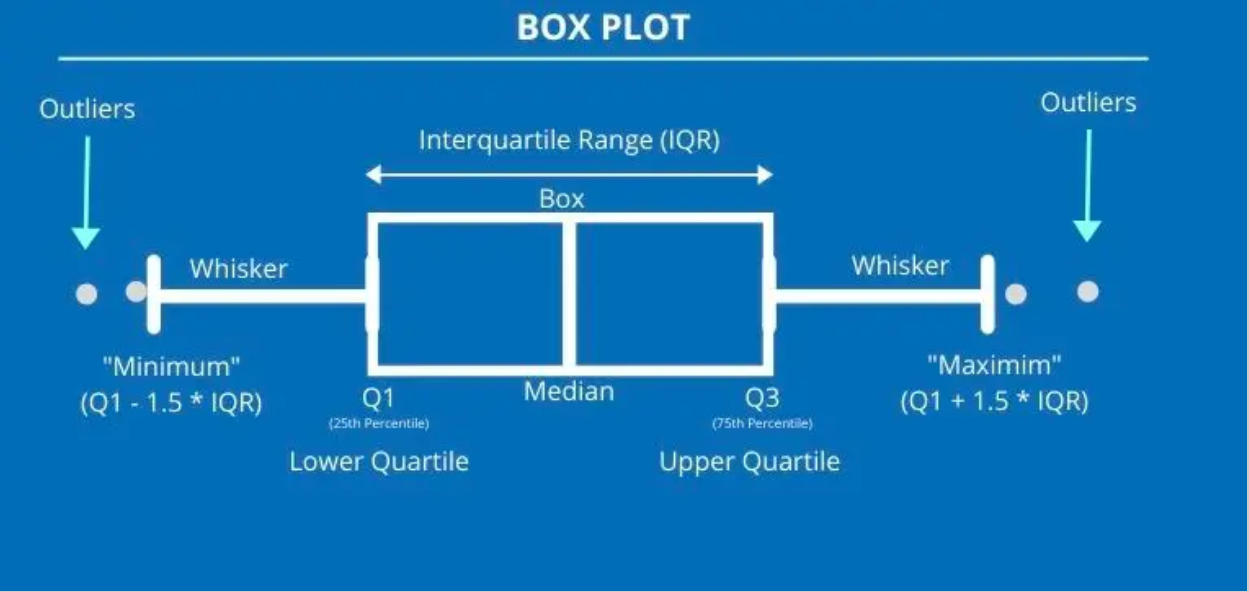
The five-figure summary effectively briefs you about key parts of a data set. Example phrasing of questions:
- “The highest value was…” → Maximum value
- “The lowest value was…” → Minimum value
- “Half the scores were equal to or greater than…” → Median
- “The top 25% of values were at least…” → Upper quartile
- “The middle half of values were between…” → Upper and lower quartile
- “The values of the middle 50% of data were spread out over…” → IQR
Standard Deviation
Standard deviation measures the “spread” of all values in a data set around the mean. Unlike range or IQR, it considers every value.
Example: If surveying heights, a high standard deviation means a wide distribution of heights. A low standard deviation means most heights are similar.
Explanation:
- Σ = sigma, meaning “sum of all”
- f = frequency
- x = data value
- x̄ = mean of data set
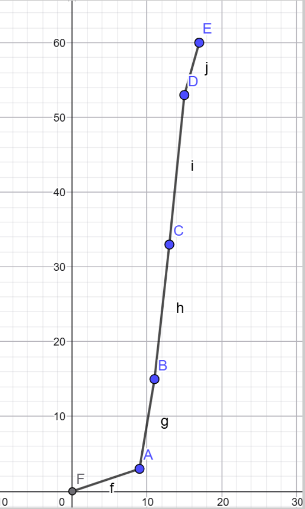
Scatter Plots
These graphs are plotted to investigate the relationship between two variables, highlighting their correlation. In a data table, the column on the left is usually plotted on the x-axis, while the one on the right is on the y-axis.
For scatter plots, a line of best fit is drawn if there is correlation between the points to illustrate a potential linear relationship. The line of best fit must:
- Pass through the mean point (average of all x-values and y-values).
- Have an equal number of points on either side of it.
Note: When calculating the slope of the line of best fit, use the values of the mean point and the origin!
Finding or predicting a data value that falls within the set of data points is called interpolation, while predicting beyond the set is called extrapolation.
Types of Correlation
- Strong Positive: Line moves upwards, points clustered around line. If x increases, y increases.
- Weak Positive: Line moves upwards, points loosely in that direction. If x increases, y tends to increase.
- Strong Negative: Line moves downwards, points clustered. If x decreases, y increases.
- Weak Negative: Line moves downwards, points loosely in that direction. If x decreases, y tends to increase.
- No Correlation: No pattern; no line of best fit possible.
Coordinate Geometry
Formulas to Recall:
- Midpoint of a line: ( (x₂ + x₁)/2 , (y₂ + y₁)/2 )
- Distance between two points: √((x₂ - x₁)² + (y₂ - y₁)²)
- Gradient: (y₂ - y₁) / (x₂ - x₁)
- Equation of a line:
- Slope-intercept: y = mx + c
- Standard form: Ax + By = C
- Vertical lines: x = a
- Horizontal lines: y = c
Collinear Points
If three or more points are collinear, their gradients are the same.
Parallel and Perpendicular Lines
- Parallel: Gradients are equal, lines never intersect.
- Perpendicular: Gradients are negative reciprocals.
Tangents
Tangents meet a circle at a single point and are perpendicular to the radius from that point.
- Find gradient of the radius.
- Take the negative reciprocal for tangent gradient.
- Use the point coordinates to find the tangent equation.
Transformations
Reflections
- My (y-axis): (x, y) → (-x, y) → y = -f(x)
- Mx (x-axis): (x, y) → (x, -y) → y = f(-x)
- My = x: (x, y) → (y, x)
- My = -x: (x, y) → (-y, -x)
Translations
Translation vector written as (x
y) vertically. Rules:
- Positive: x → right, y → up
- Negative: x → left, y → down
Shape translation formulas:
- y = f(x - h) → x-direction by h units (+h is right)
- y = f(x) + k → y-direction by k units
- y = f(x - h) + k → x and y direction
- Point formulas: x' = x + h, y' = y + k
Dilations
- Overall about O (0,0): x' = x*k, y' = y*k
- Vertical: y' = y*k, x' = x
- Horizontal: x' = x*k, y' = y
- Quadratics: f(x) = a(x-h)² + k, g(x) = af(x)
Rotations
- Clockwise 90°: (x, y) → (-y, x)
- Anticlockwise 90°: (x, y) → (y, -x)
- 180°: (x, y) → (-x, -y)
- Centre of rotation: intersection of perpendicular bisectors of lines connecting corresponding points.
Tessellations
Patterns of geometric shapes with no overlaps and no gaps. Shapes are called “tiles”.
- Regular: single shape only.
- Semi-regular: two or more shapes.
Rules for Non-Right-Angled Triangles
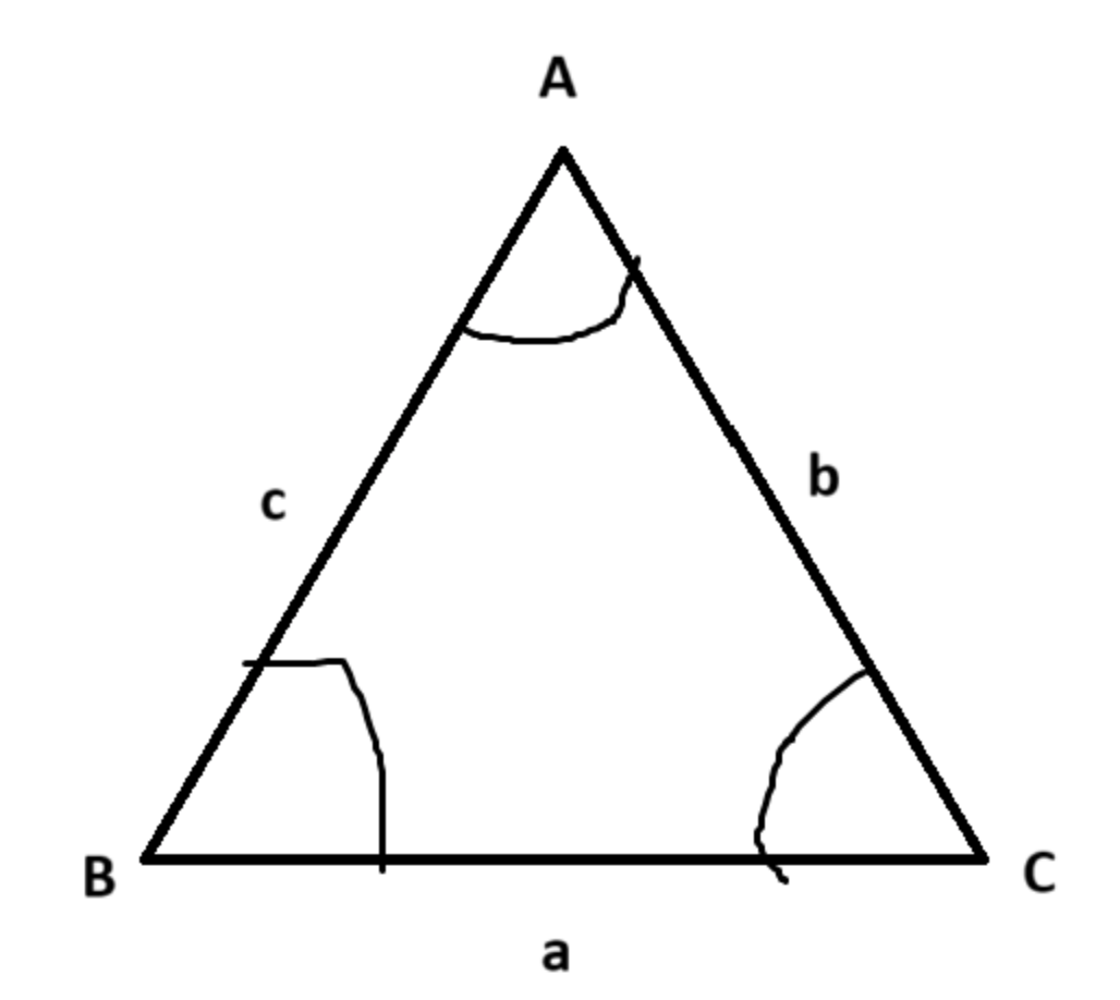
Capital letters = angles, lowercase letters = sides.
Bearings
These are a mathematical measure of direction always using north as a reference, with north = 000 bearings. These are always measured clockwise from north, and are always given in three figures, like 000, 012, 210, 360, etc. Ensure to ALWAYS INDICATE NORTH with an “N” when drawing bearings, like so:
If something is due east/west, then it will be at an exact 90 degree angle from north or south.
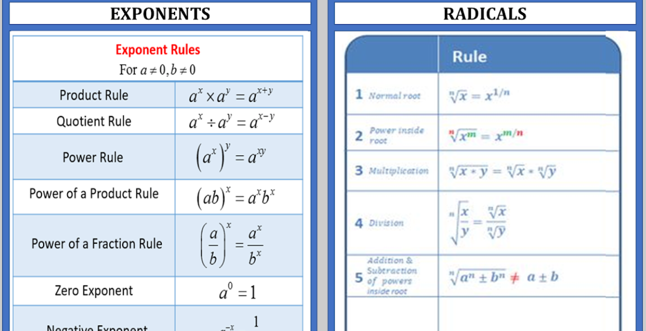
Exponents and Radicals
Simple and Compound Interest
Simple Interest Formula:
I = P × R × T
- I = interest
- P = principle amount
- R = amount per year
- T = time in years
Compound Interest Formula:
A = P(1 + r/n)^(nt)
- A = final amount
- P = principal
- r = annual interest rate (decimal)
- n = compounding periods per year
- t = years
Simple Interest Reminder
!!!Note! If a question ever asks for a “change at a constant rate relative to the year”, it means the amount of change must be the same every year, a.k.a. simple interest.
Sine and Cosine Functions
These are periodic functions because they continuously repeat themselves over a fixed interval. They are used to model waves, oscillations, and circular motion, among other applications.
General Forms
- Sine: y = a sin(bx + c) + d
- Cosine: y = a cos(bx + c) + d
Parameters Explained
- a: Amplitude – the maximum distance from the midline (controls the height of the wave)
- b: Angular frequency – affects the period (how quickly the wave repeats)
- c: Phase shift – horizontal shift of the wave along the x-axis
- d: Vertical shift – moves the wave up or down along the y-axis
Key Properties
- Period: The length of one complete cycle. For sine and cosine: Period = 2π / b
- Amplitude: Absolute value of a, the maximum height of the function from its midline
- Phase shift: Horizontal shift = -c / b
- Vertical shift: Moves the midline to y = d
Important Points on the Graph
- Sine starts at the midline and moves upwards (y = 0 when x = 0, for y = sin(x))
- Cosine starts at the maximum value (y = a when x = 0, for y = cos(x))
- They are symmetrical: sine is odd (symmetric about origin), cosine is even (symmetric about y-axis)
- Maxima and minima: sine and cosine alternate between +a and -a each period
Applications
- Modeling waves: sound waves, light waves, ocean waves
- Describing circular motion: x = r cos(θ), y = r sin(θ)
- Periodic trends in natural phenomena: seasons, tides, day/night cycles
- Engineering and physics simulations
Transformations
- Vertical stretch/compression: changes the amplitude (a)
- Horizontal stretch/compression: changes the period (b)
- Shifts up/down: vertical shift (d)
- Shifts left/right: phase shift (c/b)